Challenge: The design needed to be approachable for kids while appealing to adults, creating a universally attractive brand presence.
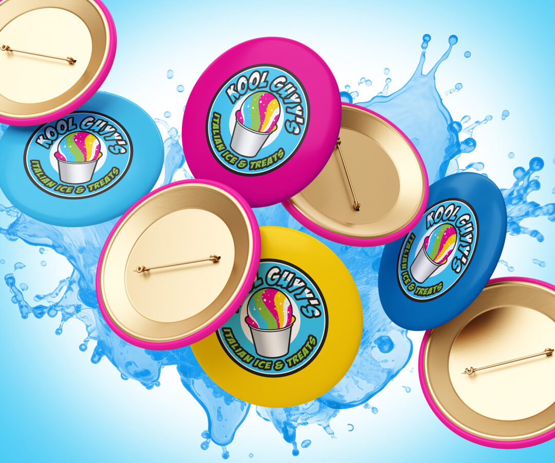
Solution: We crafted a vibrant color palette with icy blues, sunny yellows, and juicy reds to capture the refreshing essence of their treats and a sense of coolness and excitement.
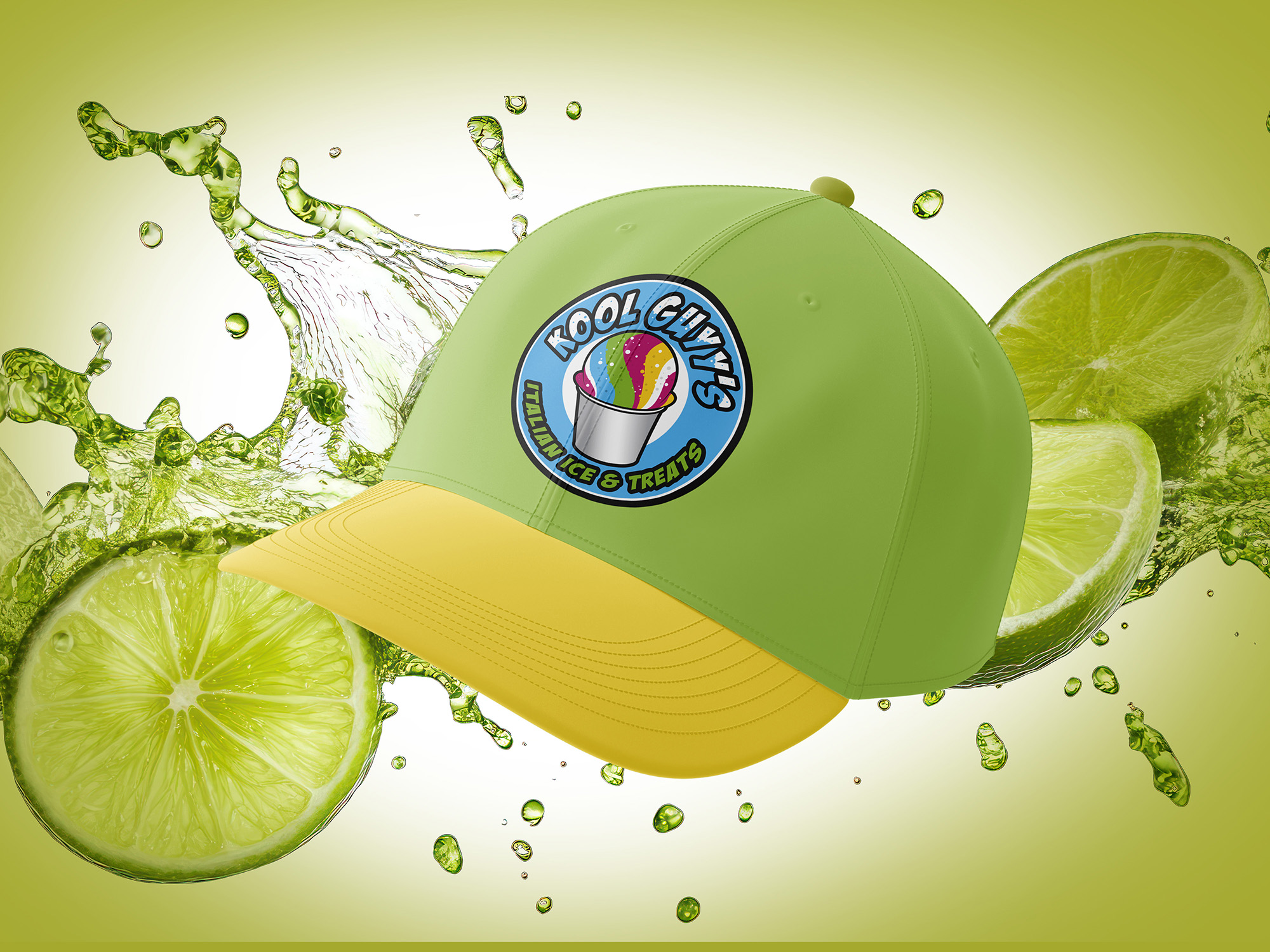
These colors not only stand out visually in crowded outdoor settings but also communicate the lively and refreshing qualities of the treats. Trust me, they’re top tier.
For typography, we chose a playful yet modern typeface that is easily readable at a distance, ensuring clarity and impact in outdoor environments. The font selection conveys a sense of fun and friendliness, aligning with the approachable nature of the brand. The overall branding strategy focused on creating a memorable and engaging customer experience that encapsulates the spirited and refreshing nature of their products.


![]()


